Hacks
6 Ways To Make Your Restaurant Menu Pop
Restaurant menus come in all different colours, shapes and sizes. What differentiates your menus from any other run of the mill restaurant will be the ultimate decider in turning a profit. After all, it is the first thing we look at when we head to the local watering hole on the weekends.
Menu engineering is a highly specialised part of any successfully run restaurant. The way your dishes compliment each other in a visually engaging manner helps in increasing sales of the items on your menu. Increase in sales leads to an increase in profit. We are in this to make money, aren’t we?
So, let’s take a look at a few ways you can improve your menu design to get the maximum profit.
Grab That Attention
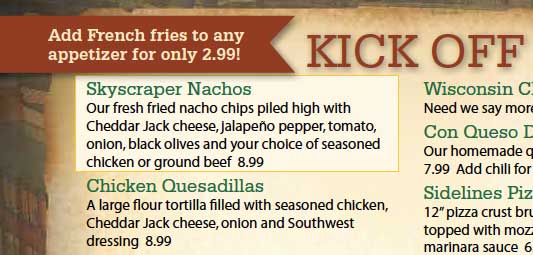
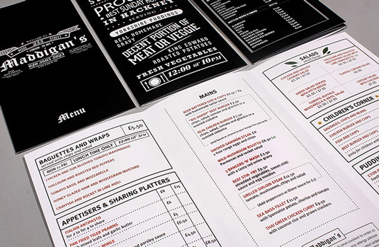
Highlighting specific items on the menu by placing a box or an asterisk around them draws the eye towards that section of the menu. You can place these visual cues around the dishes that you want to sell the most. Additional words like “Chef’s Special” or “New” also bring notice to specific menu items.
Less Is More
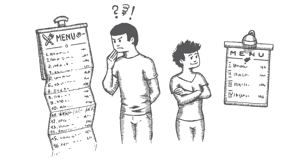
Yes, you want your restaurant to compete with all the other restaurants in the city. But that doesn’t mean you have to include all the menu items from those restaurants as well. The more items you have on the menu, the more time it takes for the customer to decide, leading to lesser turn around of tables and lesser customers being served.
Description Is Key
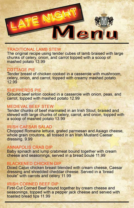
Make sure to include an engaging description of the menu item. Not only is it helpful for the customer to actually know what is in the dish, it will bring a distinctive personality to it. According to a research conducted by Cornell University, people choose highly descriptive menu items more so than their counterparts.
Leave The Amateur Photography At Home
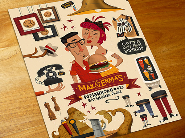
Including pictures of dishes on the menu will turn your swanky new restaurant into any other boring chain restaurant. It cheapens the value of the dishes you are serving. Use illustrations or visually engaging graphical elements to paint a vivid picture of the dishes in the minds of your customers.
Colours and Text
No, you cannot use Comic Sans for text. If you want your restaurant brand to survive in this crowded field, a distinct personality should be put across to your customers. Using effective typeface and colours based on the theme of your restaurant will make you stand out from the clutter
Capture The Eye
Eye movement patterns matter when it comes to your customers choosing dishes on your menu. Contrary to popular beliefs, menus are usually thumbed through from the top left corner, like a book. So placing menu items, which are exclusive to your restaurant, on the left will help in customers having a unique experience at your restaurant.

